“`”) while True: cmd = GetCommand() if cmd: Log(“cmd:”, cmd) Sleep(1000)
```cpp
void main() {
    json tbl = R"({
        "type": "table",
        "title": "操作",
        "cols": ["列1", "列2"],
        "rows": [
            ["开仓操作", {"type": "button", "cmd": "open", "name": "开仓", "input": {"name": "开仓数量", "type": "number", "defValue": 1}}],
            ["平仓操作", {"type": "button", "cmd": "coverAll", "name": "全部平仓"}]
        ]
    })"_json;

    LogStatus(_D(), "\n", "`" + tbl.dump() + "`");
    while(true) {
        auto cmd = GetCommand();
        if(cmd != "") {
            Log("cmd:", cmd);
        }
        Sleep(1000);
    }
}
合并LogStatus(Msg)函数画出的表格内的单元格:
-
横向合并
function main() {
    var table = {
        type: 'table',
        title: '持仓操作',
        cols: ['列1', '列2', 'Action'],
        rows: [
            ['abc', 'def', {'type':'button', 'cmd': 'coverAll', 'name': '平仓'}]
        ]
    }
    var ticker = exchange.GetTicker()
    // 添加一行数据,第一个和第二个单元格合并,并且输出ticker变量在合并后的单元格内
    table.rows.push([{body : JSON.stringify(ticker), colspan : 2}, "abc"])
    LogStatus('`' + JSON.stringify(table) + '`')
}
import json def main(): table = { "type" : "table", "title" : "持仓操作", "cols" : ["列1", "列2", "Action"], "rows" : [ ["abc", "def", {"type": "button", "cmd": "coverAll", "name": "平仓"}] ] } ticker = exchange.GetTicker() table["rows"].append([{"body": json.dumps(ticker), "colspan": 2}, "abc"]) LogStatus("`" + json.dumps(table) + "`")void main() { json table = R"({ "type" : "table", "title" : "持仓操作", "cols" : ["列1", "列2", "Action"], "rows" : [ ["abc", "def", {"type": "button", "cmd": "coverAll", "name": "平仓"}] ] })"_json; auto ticker = exchange.GetTicker(); json jsonTicker = R"({"Buy": 0, "Sell": 0, "High": 0, "Low": 0, "Volume": 0, "Last": 0, "Time": 0})"_json; jsonTicker["Buy"] = ticker.Buy; jsonTicker["Sell"] = ticker.Sell; jsonTicker["Last"] = ticker.Last; jsonTicker["Volume"] = ticker.Volume; jsonTicker["Time"] = ticker.Time; jsonTicker["High"] = ticker.High; jsonTicker["Low"] = ticker.Low; json arr = R"([{"body": {}, "colspan": 2}, "abc"])"_json; arr[0]["body"] = jsonTicker; table["rows"].push_back(arr); LogStatus("`" + table.dump() + "`"); })
-
纵向合并
function main() {
    var table = {
        type: 'table',
        title: '表格演示',
        cols: ['列A', '列B', '列C'],
        rows: [
            ['A1', 'B1', {'type':'button', 'cmd': 'coverAll', 'name': 'C1'}]
        ]
    }

    var ticker = exchange.GetTicker()
    var name = exchange.GetName()

    table.rows.push([{body : "A2 + B2:" + JSON.stringify(ticker), colspan : 2}, "C2"])
    table.rows.push([{body : "A3 + A4 + A5:" + name, rowspan : 3}, "B3", "C3"])
    // A3被上一行第一个单元格合并
    table.rows.push(["B4", "C4"])
    // A2被上一行第一个单元格合并
    table.rows.push(["B5", "C5"])
    table.rows.push(["A6", "B6", "C6"])
    LogStatus('`' + JSON.stringify(table) + '`')
}
import json def main(): table = { "type" : "table", "title" : "表格演示", "cols" : ["列A", "列B", "列C"], "rows" : [ ["A1", "B1", {"type": "button", "cmd": "coverAll", "name": "C1"}] ] } ticker = exchange.GetTicker() name = exchange.GetName() table["rows"].append([{"body": "A2 + B2:" + json.dumps(ticker), "colspan": 2}, "C2"]) table["rows"].append([{"body": "A3 + A4 + A5:" + name, "rowspan": 3}, "B3", "C3"]) table["rows"].append(["B4", "C4"]) table["rows"].append(["B5", "C5"]) table["rows"].append(["A6", "B6", "C6"]) LogStatus("`" + json.dumps(table) + "`")void main() { json table = R"({ "type" : "table", "title" : "表格演示", "cols" : ["列A", "列B", "列C"], "rows" : [ ["A1", "B1", {"type": "button", "cmd": "coverAll", "name": "C1"}] ] })"_json; // 为了测试,代码简短易读,这里使用构造的数据 json jsonTicker = R"({"High": 0, "Low": 0, "Buy": 0, "Sell": 0, "Last": 0, "Time": 0, "Volume": 0})"_json; auto name = exchange.GetName(); json arr1 = R"([{"body": "", "colspan": 2}, "C2"])"_json; arr1[0]["body"] = "A2 + B2:" + jsonTicker.dump(); json arr2 = R"([{"body": "", "rowspan": 3}, "B3", "C3"])"_json; arr2[0]["body"] = "A3 + A4 + A5:" + name; table["rows"].push_back(arr1); table["rows"].push_back(arr2); table["rows"].push_back(R"(["B4", "C4"])"_json); table["rows"].push_back(R"(["B5", "C5"])"_json); table["rows"].push_back(R"(["A6", "B6", "C6"])"_json); LogStatus("`" + table.dump() + "`"); })
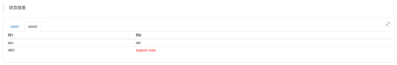
状态栏表格分页显示:
function main() {
    var table1 = {type: 'table', title: 'table1', cols: ['列1', '列2'], rows: [ ['abc', 'def'], ['ABC', 'support color #ff0000']]}
    var table2 = {type: 'table', title: 'table2', cols: ['列1', '列2'], rows: [ ['abc', 'def'], ['ABC', 'support color #ff0000']]}
    LogStatus('`' + JSON.stringify([table1, table2]) + '`')
}
import json
def main():
    table1 = {"type": "table", "title": "table1", "cols": ["列1", "列2"], "rows": [ ["abc", "def"], ["ABC", "support color #ff0000"]]}
    table2 = {"type": "table", "title": "table2", "cols": ["列1", "列2"], "rows": [ ["abc", "def"], ["ABC", "support color #ff0000"]]}
    LogStatus("`" + json.dumps([table1, table2]) + "`")
void main() {
    json table1 = R"({"type": "table", "title": "table1", "cols": ["列1", "列2"], "rows": [ ["abc", "def"], ["ABC", "support color #ff0000"]]})"_json;
    json table2 = R"({"type": "table", "title": "table2", "cols": ["列1", "列2"], "rows": [ ["abc", "def"], ["ABC", "support color #ff0000"]]})"_json;
    json arr = R"([])"_json;
    arr.push_back(table1);
    arr.push_back(table2);
    LogStatus("`" + arr.dump() + "`");
}
除了可以分页显示表格,也可以多个表格自上而下排列显示。
function main(){
    var tab1 = {
        type : "table",
        title : "表格1",
        cols : ["1", "2"],
        rows : []
    }
    var tab2 = {
        type : "table",
        title : "表格2",
        cols : ["1", "2", "3"],
        rows : []
    }
    var tab3 = {
        type : "table",
        title : "表格3",
        cols : ["A", "B", "C"],
        rows : []
    }

    tab1.rows.push(["jack", "lucy"])
    tab2.rows.push(["A", "B", "C"])
    tab3.rows.push(["A", "B", "C"])

    LogStatus('`' + JSON.stringify(tab1) + '`\n' +
        '`' + JSON.stringify(tab2) + '`\n' +
        '`' + JSON.stringify(tab3) + '`')

    Log("exit")
}
import json
def main():
    tab1 = {
        "type": "table",
        "title": "表格1",
        "cols": ["1", "2"],
        "rows": []
    }
    tab2 = {
        "type": "table",
        "title": "表格2",
        "cols": ["1", "2", "3"],
        "rows": []
    }
    tab3 = {
        "type": "table",
        "title": "表格3",
        "cols": ["A", "B", "C"],
        "rows": []
    }

    tab1["rows"].append(["jack", "lucy"])
    tab2["rows"].append(["A", "B", "C"])
    tab3["rows"].append(["A", "B", "C"])
    LogStatus("`" + json.dumps(tab1) + "`\n" +
        "`" + json.dumps(tab2) + "`\n" +
        "`" + json.dumps(tab3) + "`")
void main() {
    json tab1 = R"({
        "type": "table",
        "title": "表格1",
        "cols": ["1", "2"],
        "rows": []
    })"_json;
    json tab2 = R"({
        "type": "table",
        "title": "表格2",
        "cols": ["1", "2", "3"],
        "rows": []
    })"_json;
    json tab3 = R"({
        "type": "table",
        "title": "表格3",
        "cols": ["A", "B", "C"],
        "rows": []
    })"_json;
    tab1["rows"].push_back(R"(["jack", "lucy"])"_json);
    tab2["rows"].push_back(R"(["A", "B", "C"])"_json);
    tab3["rows"].push_back(R"(["A", "B", "C"])"_json);
    LogStatus("`" + tab1.dump() + "`\n" +
        "`" + tab2.dump() + "`\n" +
        "`" + tab3.dump() + "`");
}
运行效果:
)
注意:
策略实盘运行时,在实盘页面如果翻看历史记录,状态栏会进入休眠状态,停止更新。只有日志在第一页的时候状态栏数据才会刷新。
支持在状态栏输出base64编码后的图片,也支持在状态栏显示的表格中输出base64编码后的图片。由于编码后的图片的字符串数据一般很长,所以不再展示范例代码。
EnableLog()
EnableLog(IsEnable),打开或者关闭订单信息的日志记录。参数值:isEnable为布尔类型。IsEnable设置为false则不打印订单日志,不写入实盘数据库。
Chart(…)
Chart(...),自定义图表画图函数。
Chart({...}),参数为可以JSON序列化的HighStocks的Highcharts.StockChart参数。比原生的参数增加一个__isStock属性,如果指定__isStock:false,则显示为普通图表。
注意:
如果设置__isStock属性为false,即使用的图表为:Highcharts,如图所示:
)
如果设置__isStock属性为true,即使用的图表为:Highstocks(默认__isStock为true),如图所示:
)
返回对像可以调用add(n, data)(n为series索引(如0),data为写入图表的数据)向指定索引的series添加数据,调用reset()清空图表数据,reset可以带一个数字参数,指定保留的条数。
可以调用add(n, data, i)(i为此数据在series中的索引)来更改对应的series中的数据。
可以为负数,-1指最后一个,-2是倒数第二个,例如画线时,修改线的最后一个点上的数据:
chart.add(0, [1574993606000, 13.5], -1),更改series[0].data的倒数第一个点的数据。
支持显示多个图表,配置时只需传入数组参数即可如:var chart = Chart([{...}, {...}, {...}]),比如图表一有两个series,图表二有一个series,图表三有一个series,那么add时指定0与1序列ID代表更新图表1的两个序列的数据,add时指定序列ID为2指图表2的第一个series的数据, 指定序列3指的是图表3的第一个series的数据。
HighStocks:http://api.highcharts.com/highstock
多图表显示相关的一些属性设置:范例
例如图表配置对象:
var cfgA = {
    extension: {
        // 不参于分组,单独显示,默认为分组 'group'
        layout: 'single',
        // 指定高度,可以设置为字符串,"300px",设置数值300会自动替换为"300px"
        height: 300,
        // 指定宽度占的单元值,总值为12
        col: 8
    },
    title: {
        text: '盘口图表'
    },
    xAxis: {
        type: 'datetime'
    },
    series: [{
        name: '买一',
        data: []
    }, {
        name: '卖一',
        data: []
    }]
}

var cfgB = {
    title: {
        text: '差价图'
    },
    xAxis: {
        type: 'datetime'
    },
    series: [{
        name: '差价',
        type: 'column',
        data: []
    }]
}

var cfgC = {
    __isStock: false,
    title: {
        text: '饼图'
    },
    series: [{
        type: 'pie',
        name: 'one',
        // 指定初始数据后不需要用add函数更新,直接更改图表配置就可以更新序列
        data: [
            ["A", 25],
            ["B", 25],
            ["C", 25],
            ["D", 25]
        ]
    }]
}

var cfgD = {
    extension: {
        layout: 'single',
        // 指定宽度占的单元值,总值为12
        col: 8,
        height: '300px'
    },
    title: {
        text: '盘口图表'
    },
    xAxis: {
        type: 'datetime'
    },
    series: [{
        name: '买一',
        data: []
    }, {
        name: '卖一',
        data: []
    }]
}

var cfgE = {
    __isStock: false,
    extension: {
        layout: 'single',
        col: 4,
        height: '300px'
    },
    title: {
        text: '饼图2'
    },
    series: [{
        type: 'pie',
        name: 'one',
        data: [
            ["A", 25],
            ["B", 25],
            ["C", 25],
            ["D", 25]
        ]
    }]
}
cfgA = {
    "extension" : {
        "layout" : "single",
        "height" : 300,
        "col" : 8
    },
    "title" : {
        "text" : "盘口图表"
    },
    "xAxis" : {
        "type" : "datetime"
    },
    "series" : [{
        "name" : "买一",
        "data" : []
    }, {
        "name" : "卖一",
        "data" : []
    }]
}

cfgB = {
    "title" : {
        "text" : "差价图"
    },
    "xAxis" : {
        "type" : "datetime"
    },
    "series" : [{
        "name" : "差价",
        "type" : "column",
        "data" : []
    }]
}

cfgC = {
    "__isStock" : False,
    "title" : {
        "text" : "饼图"
    },
    "series" : [{
        "type" : "pie",
        "name" : "one",
        "data" : [
            ["A", 25],
            ["B", 25],
            ["C", 25],
            ["D", 25]
        ]
    }]
}

cfgD = {
    "extension" : {
        "layout" : "single",
        "col" : 8,
        "height" : "300px"
    },
    "title" : {
        "text" : "盘口图表"
    },
    "series" : [{
        "name" : "买一",
        "data" : []
    }, {
        "name" : "卖一",
        "data" : []
    }]
}

cfgE = {
    "__isStock" : False,
    "extension" : {
        "layout" : "single",
        "col" : 4,
        "height" : "300px"
    },
    "title" : {
        "text" : "饼图2"
    },
    "series" : [{
        "type" : "pie",
        "name" : "one",
        "data" : [
            ["A", 25],
            ["B", 25],
            ["C", 25],
            ["D", 25]
        ]
    }]
}
json cfgA = R"({
    "extension" : {
        "layout" : "single",
        "height" : 300,
        "col" : 8
    },
    "title" : {
        "text" : "盘口图表"
    },
    "xAxis" : {
        "type" : "datetime"
    },
    "series" : [{
        "name" : "买一",
        "data" : []
    }, {
        "name" : "卖一",
        "data" : []
    }]
})"_json;

json cfgB = R"({
    "title" : {
        "text" : "差价图"
    },
    "xAxis" : {
        "type" : "datetime"
    },
    "series" : [{
        "name" : "差价",
        "type" : "column",
        "data" : []
    }]
})"_json;

json cfgC = R"({
    "__isStock" : false,
    "title" : {
        "text" : "饼图"
    },
    "series" : [{
        "type" : "pie",
        "name" : "one",
        "data" : [
            ["A", 25],
            ["B", 25],
            ["C", 25],
            ["D", 25]
        ]
    }]
})"_json;

json cfgD = R"({
    "extension" : {
        "layout" : "single",
        "col" : 8,
        "height" : "300px"
    },
    "title" : {
        "text" : "盘口图表"
    },
    "series" : [{
        "name" : "买一",
        "data" : []
    }, {
        "name" : "卖一",
        "data" : []
    }]
})"_json;

json cfgE = R"({
    "__isStock" : false,
    "extension" : {
        "layout" : "single",
        "col" : 4,
        "height" : "300px"
    },
    "title" : {
        "text" : "饼图2"
    },
    "series" : [{
        "type" : "pie",
        "name" : "one",
        "data" : [
            ["A", 25],
            ["B", 25],
            ["C", 25],
            ["D", 25]
        ]
    }]
})"_json;
-
cfgA.extension.layout属性如果设置此属性,值为"single",则图表不会叠加(不会以分页标签方式显示),会单独显示(平铺显示)。
-
cfgA.extension.height属性此属性用于设置图表的高度,值可以为数值类型,或以"300px"方式设置。
-
cfgA.extension.col属性此属性用于设置图表的宽度,页面宽度一共划分为12个单元,设置8即该图表占用8个单元宽度。
运行完整范例策略:
以上范例中图表配置对象显示效果:
)
)
-
在图表配置对象上的数据,直接修改图表配置,然后更新图表即可实现数据更新:
例如范例中,
JavaScript范例部分代码段(完整范例):cfgC.series[0].data[0][1] = Math.random() * 100 cfgE.series[0].data[0][1] = Math.random() * 100 // update实际上等于重置了图表的配置 chart.update([cfgA, cfgB, cfgC, cfgD, cfgE])通过
add方法更新数据,例如给饼图增加一个项目,JavaScript范例部分代码段(完整范例):// 为饼图清加一个数点,add只能更新通过add方式添加的数据点,内置的数据点无法后期更新 chart.add(3, { name: "ZZ", y: Math.random() * 100 }) -
附带使用
Chart函数的例子简单的画图例子:
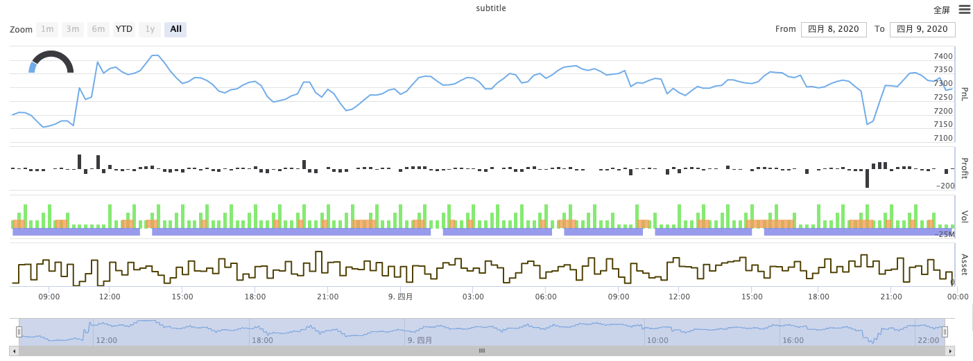
// 这个chart在JavaScript语言中是对象,在使用Chart函数之前我们需要声明一个配置图表的对象变量chart
var chart = {
    // 标记是否为一般图表,有兴趣的可以改成false运行看看
    __isStock: true,
    // 缩放工具
    tooltip: {xDateFormat: '%Y-%m-%d %H:%M:%S, %A'},
    // 标题
    title : { text : '差价分析图'},
    // 选择范围
    rangeSelector: {
        buttons:  [{type: 'hour',count: 1, text: '1h'}, {type: 'hour',count: 3, text: '3h'}, {type: 'hour', count: 8, text: '8h'}, {type: 'all',text: 'All'}],
        selected: 0,
        inputEnabled: false
    },
    // 坐标轴横轴即:x轴,当前设置的类型是:时间
    xAxis: { type: 'datetime'},
    // 坐标轴纵轴即:y轴,默认数值随数据大小调整
    yAxis : {
        // 标题
        title: {text: '差价'},
        // 是否启用右边纵轴
        opposite: false
    },
    // 数据系列,该属性保存的是各个数据系列(线,K线图,标签等...)
    series : [
        // 索引为0,data数组内存放的是该索引系列的数据
        {name : "line1", id : "线1,buy1Price", data : []},
        // 索引为1,设置了dashStyle:'shortdash'即:设置虚线
        {name : "line2", id : "线2,lastPrice", dashStyle : 'shortdash', data : []}
    ]
}
function main(){
    // 调用Chart函数,初始化图表
    var ObjChart = Chart(chart)
    // 清空
    ObjChart.reset()
    while(true){
        // 判断连接期货公司前置机是否成功。股票证券无需使用exchange.IO("status")判断连接状态
        if (!exchange.IO("status")) {
            Sleep(1000)
            continue
        }
        exchange.SetContractType("rb888")

        // 获取本次轮询的时间戳,即一个毫秒的时间戳。用来确定写入到图表的X轴的位置
        var nowTime = new Date().getTime()
        // 获取行情数据
        var ticker = _C(exchange.GetTicker)
        // 从行情数据的返回值取得买一价
        var buy1Price = ticker.Buy
        // 取得最后成交价,为了2条线不重合在一起,我们加1
        var lastPrice = ticker.Last + 1
        // 用时间戳作为X值,买一价作为Y值传入索引0的数据序列
        ObjChart.add(0, [nowTime, buy1Price])
        // 同上
        ObjChart.add(1, [nowTime, lastPrice])
        Sleep(2000)
    }
}
import time chart = { "__isStock" : True, "tooltip" : {"xDateFormat" : "%Y-%m-%d %H:%M:%S, %A"}, "title" : {"text" : "差价分析图"}, "rangeSelector" : { "buttons" : [{"type": "count", "count": 1, "text": "1h"}, {"type": "hour", "count": 3, "text": "3h"}, {"type": "hour", "count": 8, "text": "8h"}, {"type": "all", "text": "All"}], "selected": 0, "inputEnabled": False }, "xAxis": {"type": "datetime"}, "yAxis": { "title": {"text": "差价"}, "opposite": False }, "series": [{ "name": "line1", "id": "线1,buy1Price", "data": [] }, { "name": "line2", "id": "线2,lastPrice", "dashStyle": "shortdash", "data": [] }] } def main(): ObjChart = Chart(chart) ObjChart.reset() while True: if not exchange.IO("status"): Sleep(1000) continue exchange.SetContractType("rb888") nowTime = time.time() * 1000 ticker = exchange.GetTicker() buy1Price = ticker["Buy"] lastPrice = ticker["Last"] + 1 ObjChart.add(0, [nowTime, buy1Price]) ObjChart.add(1, [nowTime, lastPrice]) Sleep(2000)void main() { // C++编写策略时,尽量不要声明非基础类型的全局变量,所以图表配置对象声明在main函数内 json chart = R"({ "__isStock" : true, "tooltip" : {"xDateFormat" : "%Y-%m-%d %H:%M:%S, %A"}, "title" : {"text" : "差价分析图"}, "rangeSelector" : { "buttons" : [{"type": "count", "count": 1, "text": "1h"}, {"type": "hour", "count": 3, "text": "3h"}, {"type": "hour", "count": 8, "text": "8h"}, {"type": "all", "text": "All"}], "selected": 0, "inputEnabled": false }, "xAxis": {"type": "datetime"}, "yAxis": { "title": {"text": "差价"}, "opposite": false }, "series": [{ "name": "line1", "id": "线1,buy1Price", "data": [] }, { "name": "line2", "id": "线2,lastPrice", "dashStyle": "shortdash", "data": [] }] })"_json; auto ObjChart = Chart(chart); ObjChart.reset(); while(true) { if (exchange.IO("status") == 0) { Sleep(1000); continue; } exchange.SetContractType("rb888"); auto nowTime = Unix() * 1000; auto ticker = exchange.GetTicker(); auto buy1Price = ticker.Buy; auto lastPrice = ticker.Last + 1.0; ObjChart.add(0, {nowTime, buy1Price}); ObjChart.add(1, {nowTime, lastPrice}); Sleep(2000); } }三角函数曲线画图例子:
// 用于初始化图表的对象
var chart = {
    // 图表标题
    title: {text: "line数值触发 plotLines 值"},
    // Y轴相关设置
    yAxis: {
        // 垂直于Y轴的水平线,用作触发线,是一个结构数组,可以设置多条触发线
        plotLines: [{
            // 触发线的值,设置多少这条线就在相应的数值位置显示
            value: 0,
            // 设置触发线的颜色
            color: 'red',
            // 宽度
            width: 2,
            // 显示的标签
            label: {
                // 标签文本
                text: '触发值',
                // 标签位置居中
                align: 'center'
            }
        }]
    },
    // X轴相关设置,这里设置类型是时间轴
    xAxis: {type: "datetime"},
    series: [
        {name: "sin", type: "spline", data: []},
        // 这个是比较重要的数据系列,可以设置多个数据系列,根据数组索引控制
        {name: "cos", type: "spline", data: []}
    ]
}
function main(){
    // 圆周率
    var pi = 3.1415926535897
    // 用于记录时间戳的变量
    var time = 0
    // 角度
    var angle = 0
    // 坐标y值,用于接收正弦值、余弦值
    var y = 0
    // 调用API接口用chart对象初始化图表
    var objChart = Chart(chart)
    // 初始清空图表
    objChart.reset()
    // 设置触发线的值为1
    chart.yAxis.plotLines[0].value = 1
    // 循环
    while(true){
        // 获取当前时刻的时间戳
        time = new Date().getTime()
        // 每500ms角度angle增加5度,计算正弦值
        y = Math.sin(angle * 2 * pi / 360)
        // 把计算出来的y值写入图表相应索引的数据系列add函数第一个参数为指定的索引
        objChart.add(0, [time, y])
        // 计算余弦值
        y = Math.cos(angle * 2 * pi / 360)
        objChart.add(1, [time, y])
        // 增加5度
        angle += 5
        // 暂停5秒,以免画图太频繁,数据增长过快
        Sleep(5000)
    }
}
import math import time chart = { "title": {"text": "line数值触发 plotLines 值"}, "yAxis": { "plotLines": [{ "value": 0, "color": "red", "width": 2, "label": { "text": "触发值", "align": "center" } }] }, "xAxis": {"type": "datetime"}, "series": [{"name": "sin", "type": "spline", "data": []}, {"name": "cos", "type": "spline", "data": []}] } def main(): pi = 3.1415926535897 ts = 0 angle = 0 y = 0 objChart = Chart(chart) objChart.reset() chart["yAxis"]["plotLines"][0]["value"] = 1 while True: ts = time.time() * 1000 y = math.sin(angle * 2 * pi / 360) objChart.add(0, [ts, y]) y = math.cos(angle * 2 * pi / 360) objChart.add(1, [ts, y]) angle += 5 Sleep(5000)void main() { json chart = R"({ "title": {"text": "line数值触发 plotLines 值"}, "yAxis": { "plotLines": [{ "value": 0, "color": "red", "width": 2, "label": { "text": "触发值", "align": "center" } }] }, "xAxis": {"type": "datetime"}, "series": [{"name": "sin", "type": "spline", "data": []}, {"name": "cos", "type": "spline", "data": []}] })"_json; auto pi = 3.1415926535897; auto ts = 0; auto angle = 0.0; auto y = 0.0; auto objChart = Chart(chart); objChart.reset(); chart["yAxis"]["plotLines"][0]["value"] = 1; while(true) { ts = Unix() * 1000; y = sin(angle * 2 * pi / 360); objChart.add(0, {ts, y}); y = cos(angle * 2 * pi / 360); objChart.add(1, {ts, y}); angle += 5; Sleep(5000); } }C++策略中Chart函数也可以使用编码过的字符串配置图表:void main () { Chart c = Chart(R"EOF({"chart":{"type":"line"},"title":{"text":"简单图表"},"xAxis":{"title":{"text":"Date"}},"yAxis":{"title":{"text":"Number"}},"series":[{"name":"number","data":[]}]})EOF"); c.reset(); for (size_t i = 0; i < 10; i++) { // sprintf比如int64在32位与64位下有不同的参数, 所以最好跟平台有关的类型用toString变成字符串再传进去 c.add(0, format("[%s, %d]", toString(Unix() + i).c_str(), rand() % 100)); } })
-
使用混合图表的复杂例子 JavaScript策略地址
/*backtest
start: 2020-03-11 00:00:00
end: 2020-04-09 23:59:00
period: 1d
basePeriod: 1h
exchanges: [{"eid":"Futures_CTP","currency":"FUTURES"}]
*/

var chartCfg = {
    subtitle: {
        text: "subtitle",
    },
    yAxis: [{
        height: "40%",
        lineWidth: 2,
        title: {
            text: 'PnL',
        },
        tickPixelInterval: 20,
        minorGridLineWidth: 1,
        minorTickWidth: 0,
        opposite: true,
        labels: {
            align: "right",
            x: -3,
        }
    }, {
        title: {
            text: 'Profit',
        },
        top: "42%",
        height: "18%",
        offset: 0,
        lineWidth: 2
    }, {
        title: {
            text: 'Vol',
        },
        top: '62%',
        height: '18%',
        offset: 0,
        lineWidth: 2
    }, {
        title: {
            text: 'Asset',
        },
        top: '82%',
        height: '18%',
        offset: 0,
        lineWidth: 2
    }],
    series: [{
        name: 'PnL',
        data: [],
        id: 'primary',
        tooltip: {
            xDateFormat: '%Y-%m-%d %H:%M:%S'
        },
        yAxis: 0
    }, {
        type: 'column',
        lineWidth: 2,
        name: 'Profit',
        data: [],
        yAxis: 1,
    }, {
        type: 'column',
        name: 'Trade',
        data: [],
        yAxis: 2
    }, {
        type: 'area',
        step: true,
        lineWidth: 0,
        name: 'Long',
        data: [],
        yAxis: 2
    }, {
        type: 'area',
        step: true,
        lineWidth: 0,
        name: 'Short',
        data: [],
        yAxis: 2
    }, {
        type: 'line',
        step: true,
        color: '#5b4b00',
        name: 'Asset',
        data: [],
        yAxis: 3
    }, {
        type: 'pie',
        innerSize: '70%',
        name: 'Random',
        data: [],
        center: ['3%', '6%'],
        size: '15%',
        dataLabels: {
            enabled: false
        },
        startAngle: -90,
        endAngle: 90,
    }],
};

function main() {
    let c = Chart(chartCfg);
    let preTicker = null;
    while (true) {
        if (!exchange.IO("status")) {
            Sleep(1000)
            continue
        }
        exchange.SetContractType("rb888")

        let t = exchange.GetTicker();

        c.add(0, [t.Time, t.Last]); // PnL
        c.add(1, [t.Time, preTicker ? t.Last - preTicker.Last : 0]); // profit
        let r = Math.random();
        var pos = parseInt(t.Time/86400);
        c.add(2, [t.Time, pos/2]); // Vol
        c.add(3, [t.Time, r > 0.8 ? pos : null]); // Long
        c.add(4, [t.Time, r < 0.8 ? -pos : null]); // Short
        c.add(5, [t.Time, Math.random() * 100]); // Asset
        // update pie
        chartCfg.series[chartCfg.series.length-1].data = [
            ["A", Math.random()*100],
            ["B", Math.random()*100],
         ];
        c.update(chartCfg)
        preTicker = t;
    }
}
'''backtest
start: 2020-03-11 00:00:00
end: 2020-04-09 23:59:00
period: 1d
basePeriod: 1h
exchanges: [{"eid":"Futures_CTP","currency":"FUTURES"}]
'''

import random

chartCfg = {
    "subtitle": {
        "text": "subtitle"
    },
    "yAxis": [{
        "height": "40%",
        "lineWidth": 2,
        "title": {
            "text": 'PnL'
        },
        "tickPixelInterval": 20,
        "minorGridLineWidth": 1,
        "minorTickWidth": 0,
        "opposite": True,
        "labels": {
            "align": "right",
            "x": -3
        }
    }, {
        "title": {
            "text": 'Profit'
        },
        "top": "42%",
        "height": "18%",
        "offset": 0,
        "lineWidth": 2
    }, {
        "title": {
            "text": 'Vol'
        },
        "top": '62%',
        "height": '18%',
        "offset": 0,
        "lineWidth": 2
    }, {
        "title": {
            "text": 'Asset'
        },
        "top": '82%',
        "height": '18%',
        "offset": 0,
        "lineWidth": 2
    }],
    "series": [{
        "name": 'PnL',
        "data": [],
        "id": 'primary',
        "tooltip": {
            "xDateFormat": '%Y-%m-%d %H:%M:%S'
        },
        "yAxis": 0
    }, {
        "type": 'column',
        "lineWidth": 2,
        "name": 'Profit',
        "data": [],
        "yAxis": 1
    }, {
        "type": 'column',
        "name": 'Trade',
        "data": [],
        "yAxis": 2
    }, {
        "type": 'area',
        "step": True,
        "lineWidth": 0,
        "name": 'Long',
        "data": [],
        "yAxis": 2
    }, {
        "type": 'area',
        "step": True,
        "lineWidth": 0,
        "name": 'Short',
        "data": [],
        "yAxis": 2
    }, {
        "type": 'line',
        "step": True,
        "color": '#5b4b00',
        "name": 'Asset',
        "data": [],
        "yAxis": 3
    }, {
        "type": 'pie',
        "innerSize": '70%',
        "name": 'Random',
        "data": [],
        "center": ['3%', '6%'],
        "size": '15%',
        "dataLabels": {
            "enabled": False
        },
        "startAngle": -90,
        "endAngle": 90
    }]
}

def main():
    c = Chart(chartCfg)
    preTicker = None
    while True:
        if not exchange.IO("status"):
            Sleep(1000)
            continue
        exchange.SetContractType("rb888")

        t = exchange.GetTicker()
        c.add(0, [t["Time"], t["Last"]])
        profit = t["Last"] - preTicker["Last"] if preTicker else 0
        c.add(1, [t["Time"], profit])
        r = random.random()
        pos = t["Time"] / 86400
        c.add(2, [t["Time"], pos / 2])
        long = pos if r > 0.8 else None
        c.add(3, [t["Time"], long])
        short = -pos if r < 0.8 else None
        c.add(4, [t["Time"], short])
        c.add(5, [t["Time"], random.random() * 100])

        # update pie
        chartCfg["series"][len(chartCfg["series"]) - 1]["data"] = [
            ["A", random.random() * 100],
            ["B", random.random() * 100]
        ]
        c.update(chartCfg)
        preTicker = t
/*backtest
start: 2020-03-11 00:00:00
end: 2020-04-09 23:59:00
period: 1d
basePeriod: 1h
exchanges: [{"eid":"Futures_CTP","currency":"FUTURES"}]
*/

void main() {
    json chartCfg = R"({
        "subtitle": {
            "text": "subtitle"
        },
        "yAxis": [{
            "height": "40%",
            "lineWidth": 2,
            "title": {
                "text": "PnL"
            },
            "tickPixelInterval": 20,
            "minorGridLineWidth": 1,
            "minorTickWidth": 0,
            "opposite": true,
            "labels": {
                "align": "right",
                "x": -3
            }
        }, {
            "title": {
                "text": "Profit"
            },
            "top": "42%",
            "height": "18%",
            "offset": 0,
            "lineWidth": 2
        }, {
            "title": {
                "text": "Vol"
            },
            "top": "62%",
            "height": "18%",
            "offset": 0,
            "lineWidth": 2
        }, {
            "title": {
                "text": "Asset"
            },
            "top": "82%",
            "height": "18%",
            "offset": 0,
            "lineWidth": 2
        }],
        "series": [{
            "name": "PnL",
            "data": [],
            "id": "primary",
            "tooltip": {
                "xDateFormat": "%Y-%m-%d %H:%M:%S"
            },
            "yAxis": 0
        }, {
            "type": "column",
            "lineWidth": 2,
            "name": "Profit",
            "data": [],
            "yAxis": 1
        }, {
            "type": "column",
            "name": "Trade",
            "data": [],
            "yAxis": 2
        }, {
            "type": "area",
            "step": true,
            "lineWidth": 0,
            "name": "Long",
            "data": [],
            "yAxis": 2
        }, {
            "type": "area",
            "step": true,
            "lineWidth": 0,
            "name": "Short",
            "data": [],
            "yAxis": 2
        }, {
            "type": "line",
            "step": true,
            "color": "#5b4b00",
            "name": "Asset",
            "data": [],
            "yAxis": 3
        }, {
            "type": "pie",
            "innerSize": "70%",
            "name": "Random",
            "data": [],
            "center": ["3%", "6%"],
            "size": "15%",
            "dataLabels": {
                "enabled": false
            },
            "startAngle": -90,
            "endAngle": 90
        }]
    })"_json;

    Chart c = Chart(chartCfg);
    Ticker preTicker;
    while(true) {
        if (exchange.IO("status") != 0) {
            Sleep(1000);
            continue;
        }
        exchange.SetContractType("rb888");

        auto t = exchange.GetTicker();
        c.add(0, {t.Time, t.Last});
        auto profit = preTicker.Valid ? t.Last - preTicker.Last : 0;
        c.add(1, {t.Time, profit});
        auto r = rand() % 100;
        auto pos = t.Time / 86400.0;
        c.add(2, {t.Time, pos / 2.0});
        auto longPos = r > 0.8 ? pos : NULL;
        c.add(3, {t.Time, longPos});
        auto shortPos = r < 0.8 ? -pos : NULL;
        c.add(4, {t.Time, shortPos});
        c.add(5, {t.Time, rand() % 100});

        // update pie
        json pie = R"([["A", 0], ["B", 0]])"_json;
        pie[0][1] = rand() % 100;
        pie[1][1] = rand() % 100;
        chartCfg["series"][chartCfg["series"].size() - 1]["data"] = pie;

        c.update(chartCfg);
        preTicker = t;
    }
}
图表中pie类型的图是没有时间轴的图表,在更新数据时需要直接更新图表配置。例如以上范例中的代码,更新数据后使用c.update(chartCfg)更新图表,如下所示:
    // update pie
    chartCfg.series[chartCfg.series.length-1].data = [
        ["A", Math.random()*100],
        ["B", Math.random()*100],
    ];
    c.update(chartCfg)
    # update pie
    chartCfg["series"][len(chartCfg["series"]) - 1]["data"] = [
        ["A", random.random() * 100],
        ["B", random.random() * 100]
    ]
    c.update(chartCfg)
    // update pie
    json pie = R"([["A", 0], ["B", 0]])"_json;
    pie[0][1] = rand() % 100;
    pie[1][1] = rand() % 100;
    chartCfg["series"][chartCfg["series"].size() - 1]["data"] = pie;
    c.update(chartCfg);
运行结果:
KLineChart(…)
KLineChart(chartCfg),该函数用于使用类似Pine语言的画图方式进行策略运行时的自定义画图,策略自定义画图只能使用KLineChart()方式或者Chart()方式中的一种。
参考代码:
function main() {
    // 调用KLineChart函数创建图表控制对象c
    let c = KLineChart({
        overlay: true
    })

    while(true) {
        if (exchange.IO("status")) {
            break
        }
        Sleep(1000)
    }
    exchange.SetContractType("rb888")

    // 获取K线
    let bars = exchange.GetRecords()
    if (!bars) {
        return
    }

    bars.forEach(function(bar, index) {
        c.begin(bar)
        c.barcolor(bar.Close > bar.Open ? 'rgba(255, 0, 0, 0.2)' : 'rgba(0, 0, 0, 0.2)')
        if (bar.Close > bar.Open) {
            c.bgcolor('rgba(0, 255, 0, 0.5)')
        }
        let h = c.plot(bar.High, 'high')
        let l = c.plot(bar.Low, 'low')

        c.fill(h, l, {
            color: bar.Close > bar.Open ? 'rgba(255, 0, 0, 0.2)' : 'rgba(255, 0, 0, 0.2)'
        })
        c.hline(bar.High)
        c.plotarrow(bar.Close - bar.Open)
        c.plotshape(bar.Low, {
            style: 'diamond'
        })
        c.plotchar(bar.Close, {
            char: 'X'
        })
        c.plotcandle(bar.Open*0.9, bar.High*0.9, bar.Low*0.9, bar.Close*0.9)
        if (bar.Close > bar.Open) {
            // long/short/closelong/closeshort
            c.signal("long", bar.High, 1.5)
        } else if (bar.Close < bar.Open) {
            c.signal("closelong", bar.Low, 1.5)
        }
        c.close()
    })
}
def main():
    # 调用KLineChart函数创建图表控制对象c
    c = KLineChart({
        "overlay": True
    })

    while True:
        if exchange.IO("status"):
            break
        Sleep(1000)
    exchange.SetContractType("rb888")

    # 获取K线
    bars = exchange.GetRecords()
    if not bars:
        return

    for bar in bars:
        c.begin(bar)
        c.barcolor('rgba(255, 0, 0, 0.2)' if bar.Close > bar.Open else 'rgba(0, 0, 0, 0.2)')
        if bar.Close > bar.Open:
            c.bgcolor('rgba(0, 255, 0, 0.5)')

        h = c.plot(bar.High, 'high')
        l = c.plot(bar.Low, 'low')

        c.fill(h, l, 'rgba(255, 0, 0, 0.2)' if bar.Close > bar.Open else 'rgba(255, 0, 0, 0.2)')
        c.hline(bar.High)
        c.plotarrow(bar.Close - bar.Open)
        c.plotshape(bar.Low, style = 'diamond')
        c.plotchar(bar.Close, char = 'X')
        c.plotcandle(bar.Open*0.9, bar.High*0.9, bar.Low*0.9, bar.Close*0.9)
        if bar.Close > bar.Open:
            # long/short/closelong/closeshort
            c.signal("long", bar.High, 1.5)
        elif bar.Close < bar.Open:
            c.signal("closelong", bar.Low, 1.5)

        c.close()
// 暂不支持
如果在策略自定义画图区域画图必须有图表控制对象,使用函数KLineChart创建该对象。KLineChart函数的参数为一个图表配置结构,在参考代码中使用的图表结构很简单{overlay: true})。这个图表配置结构仅仅设置了画图内容在图表主图上输出,如果overlay设置为false则图表上的内容都输出在副图上,如果需要指定某个画图函数在主图上画出也可以在具体函数调用中指定参数overlay为true。
在K线数据上遍历执行画图操作,画图操作中必须以c.begin(bar)函数调用作为起始,以c.close()函数调用作为结束。画图操作中支持的Pine语言的画图接口函数有:
-
barcolor:设置K线颜色
barcolor(color, offset, editable, show_last, title, display)
c.barcolor(bar.Close > bar.Open ? 'rgba(255, 0, 0, 0.2)' : 'rgba(0, 0, 0, 0.2)') // 使用本例中参考代码中的例子说明,不再赘述c.barcolor('rgba(255, 0, 0, 0.2)' if bar.Close > bar.Open else 'rgba(0, 0, 0, 0.2)')display参数可选:“none”, “all”
-
bgcolor:用指定颜色填充K线的背景
bgcolor(color, offset, editable, show_last, title, display, overlay)
c.bgcolor('rgba(0, 255, 0, 0.5)')c.bgcolor('rgba(0, 255, 0, 0.5)')display参数可选:“none”, “all”
-
plot:在图表上绘制一系列数据
plot(series, title, color, linewidth, style, trackprice, histbase, offset, join, editable, show_last, display)
c.plot(bar.High, 'high')h = c.plot(bar.High, 'high')style参数可选:“stepline_diamond”, “stepline”, “cross”, “areabr”, “area”, “circles”, “columns”, “histogram”, “linebr”, “line”display参数可选:“none”, “all”
-
fill:使用提供的颜色填充两个绘图或hline之间的背景
fill(hline1, hline2, color, title, editable, fillgaps, display)
let h = c.plot(bar.High, 'high')
let l = c.plot(bar.Low, 'low')

c.fill(h, l, {color: bar.Close > bar.Open ? 'rgba(255, 0, 0, 0.2)' : 'rgba(255, 0, 0, 0.2)'})
h = c.plot(bar.High, 'high') l = c.plot(bar.Low, 'low') c.fill(h, l, {"color": 'rgba(255, 0, 0, 0.2)' if bar.Close > bar.Open else 'rgba(255, 0, 0, 0.2)'})display参数可选:“none”, “all”
由于
JavaScript语言不能根据函数形参名称指定传入参数,为了解决这个问题可以使用一个{key: value}结构指定传入某个形参名称的参数,例如参考代码中使用{color: bar.Close > bar.Open ? 'rgba(255, 0, 0, 0.2)' : 'rgba(255, 0, 0, 0.2)'}指定fill函数的color参数。如果需要连续指定多个形参名称的参数,可以使用{key1: value1, key2: value2, key3: value3}。例如本例子中增加指定一个title参数:{color: bar.Close > bar.Open ? 'rgba(255, 0, 0, 0.2)' : 'rgba(255, 0, 0, 0.2)', title: 'fill'}。对于颜色值可以使用
'rgba(255, 0, 0, 0.2)'方式设置,也可以使用'#FF0000'方式设置。 -
hline:在给定的固定价格水平上呈现水平线
hline(price, title, color, linestyle, linewidth, editable, display)
c.hline(bar.High)c.hline(bar.High)linestyle参数可选:“dashed”, “dotted”, “solid”display参数可选:“none”, “all”
-
plotarrow:在图表上绘制向上和向下箭头
plotarrow(series, title, colorup, colordown, offset, minheight, maxheight, editable, show_last, display)
c.plotarrow(bar.Close - bar.Open)c.plotarrow(bar.Close - bar.Open)display参数可选:“none”, “all”
-
plotshape:在图表上绘制可视形状
plotshape(series, title, style, location, color, offset, text, textcolor, editable, size, show_last, display)
c.plotshape(bar.Low, {style: 'diamond'})c.plotshape(bar.Low, style = 'diamond')-
style参数可选:“diamond”, “square”, “label_down”, “label_up”, “arrow_down”, “arrow_up”, “circle”, “flag”, “triangle_down”, “triangle_up”, “cross”, “xcross” -
location参数可选:“abovebar”, “belowbar”, “top”, “bottom”, “absolute” -
size参数可选:“10px”, “14px”, “20px”, “40px”, “80px”,对比Pine语言中的size.tiny、size.small、size.normal、size.large、size.hugesize.auto即size.small。 -
display参数可选:“none”, “all”
-
-
plotchar:在图表上使用任何给定的Unicode字符绘制可视形状
plotchar(series, title, char, location, color, offset, text, textcolor, editable, size, show_last, display)
c.plotchar(bar.Close, {char: 'X'})c.plotchar(bar.Close, char = 'X')-
location参数可选:“abovebar”, “belowbar”, “top”, “bottom”, “absolute” -
size参数可选:“10px”, “14px”, “20px”, “40px”, “80px”,对比Pine语言中的size.tiny、size.small、size.normal、size.large、size.hugesize.auto即size.small。 -
display参数可选:“none”, “all”
-
-
plotcandle:在图表上绘制K线图
plotcandle(open, high, low, close, title, color, wickcolor, editable, show_last, bordercolor, display)
c.plotcandle(bar.Open*0.9, bar.High*0.9, bar.Low*0.9, bar.Close*0.9)c.plotcandle(bar.Open*0.9, bar.High*0.9, bar.Low*0.9, bar.Close*0.9)display参数可选:“none”, “all”
-
signal:Pine语言上没有的函数,这里用来画买卖信号
signal(direction, price, qty, id)
c.signal("long", bar.High, 1.5)c.signal("long", bar.High, 1.5)传入的参数
"long"表示交易方向,可选"long"、"closelong"、"short"、"closeshort"。传入的参数bar.High为标记信号的Y轴位置。传入的参数1.5表示信号的交易数量。可以传入第四个参数用来替换默认画出的文本内容,画出的信号标记默认文本为交易方向,例如:"closelong"。
以上函数调用时用到的一些颜色、样式等设置,参看使用KLineChart函数画图的专题文章
LogReset()
LogReset(),该函数用于清除日志。可以传入一个整数数值参数,指定保留最近日志条数,清除其余日志。每次启动的启动日志算一条,所以如果不传入参数并且策略起始时没有日志输出,就会完全不显示日志,等待托管者日志回传(并非异常情况)。该函数无返回值。
function main() {
    // 保留最近10条日志,清除其余日志
    LogReset(10)
}
def main():
    LogReset(10)
void main() {
    LogReset(10);
}
LogVacuum()
LogVacuum(),在调用LogReset()函数清除日志后,回收SQLite删除数据时占用的储存空间。该函数无返回值。
原因是SQLite删除数据时不回收占用的空间,需要执行VACUUM清理表,释放空间。该函数调用时会发生文件移动操作,延迟较大,建议在合适的时间间隔调用。
行情API
主要的行情接口函数:
| 函数名 | 说明 |
|---|---|
| GetTicker | 获取tick行情数据 |
| GetRecords | 获取K线数据 |
| GetDepth | 获取订单薄数据(订单深度数据) |
| GetTrades | 获取市场上最近交易记录 |
以下函数均可通过exchange或exchanges[0]对象调用,例如:exchange.GetTicker()或exchanges[0].GetTicker(),函数返回当前交易对、设置合约的市场行情数据。
带有网络访问的API函数调用的重要提示:
在调用任何访问交易所接口的API函数时(如exchange.GetTicker()、exchange.Buy(Price, Amount)、```e